
Best Founders and Owners Email Signature Solutions — Examples & Tips
Funny thing: people often think the bit of text at the bottom of an email is just filler. A formality. A name, maybe a phone number. But—let me tell you—that tiny strip of pixels is your handshake, your business card, your billboard… all squeezed into a couple of lines. It’s got more power than most folks give it credit for.
If you’re the one running the show—the founder, the owner, the boss with the vision—your signature isn’t decoration. It’s your stamp of authority. It’s the moment people decide, “Okay, these folks have their act together.” And believe me, every email you send is another little chance to prove that.
Sometimes, it’s not even about you. It’s about the brand you’re building. The tone. The face you show to investors, partners, or that potential client who’s reading you at midnight on their phone.
Quick Hits
- Leadership matters: your signature whispers, “I’m steering this ship.”
- Built-in marketing: each message doubles as subtle promo space.
- Clarity is king: keep it sharp, not cluttered.
- MySigMail exists: it makes whipping up a signature almost too easy.
Why Bother With a “Proper” Signature?
Here’s the thing: if you’re the founder or owner, you are the company (at least in people’s eyes). Your words, your tone, even your closing line—it all reflects the brand.
A solid signature? It breeds trust. Investors relax, clients nod, and partners stop wondering if you’re just freelancing out of a spare bedroom.
Oh, and don’t underestimate its marketing value. You can drop in a milestone, a shiny new product launch, or even a link to book a demo. Zero extra effort, infinite impressions.
Let’s Break Down Why This Matters
- Your Brand in Miniature: Every signature is a reminder you exist.
- Authority & Trust: A clean, professional design tells people you’re legit.
- Free Marketing: Promote without shouting.
- Easy Contact: One click and they’re in touch—no hunting around.
Real Founder & Owner Email Signature Examples
Talk is cheap — here’s what these signatures actually look like. Four layouts for four stages of running the show, all built in MySigMail in minutes.
1. The Early-Stage Founder
Lean, like your startup: name in an accent color, “Founder & CEO,” product link, and nothing that smells like a corporation.
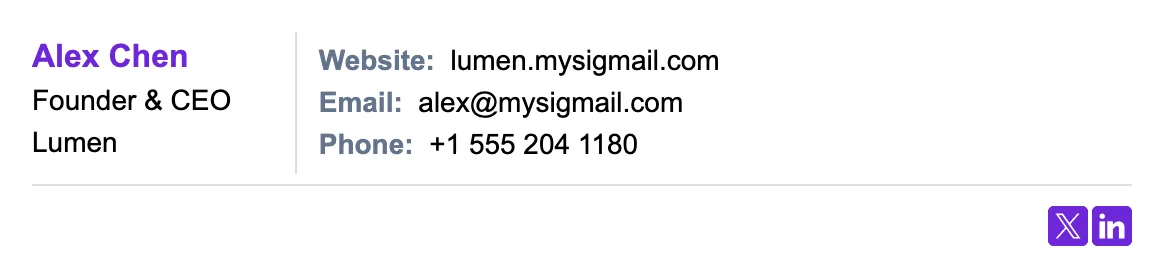
Why it works: at pre-seed, you are the product's credibility. The uncluttered layout reads confident rather than scrappy, and the single product link sends every investor and early user to the one place that matters.
2. The Personal Brand
For founders who build in public: headshot, X and LinkedIn icons, and a “Try Product” button.
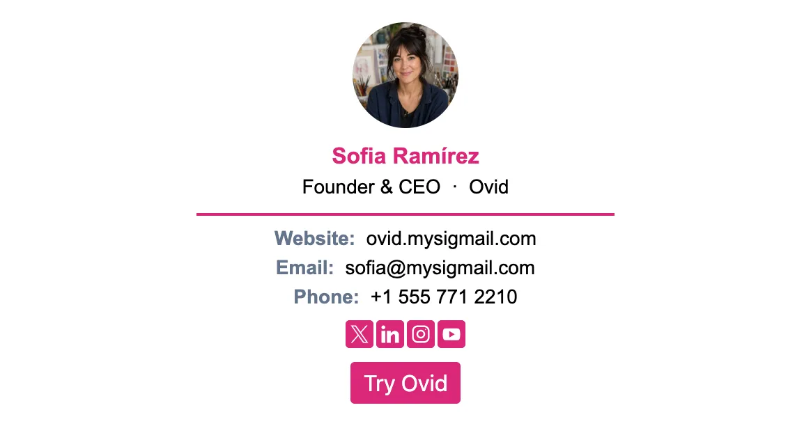
Why it works: if your audience follows you, the signature should close the loop — face for recognition, two social links (not six) for the follow, and the product button so the attention lands somewhere that converts.
3. The Local Business Owner
For owners of a shop, agency, or studio: business logo, your name plus “Owner,” phone, website, and a Google reviews badge.
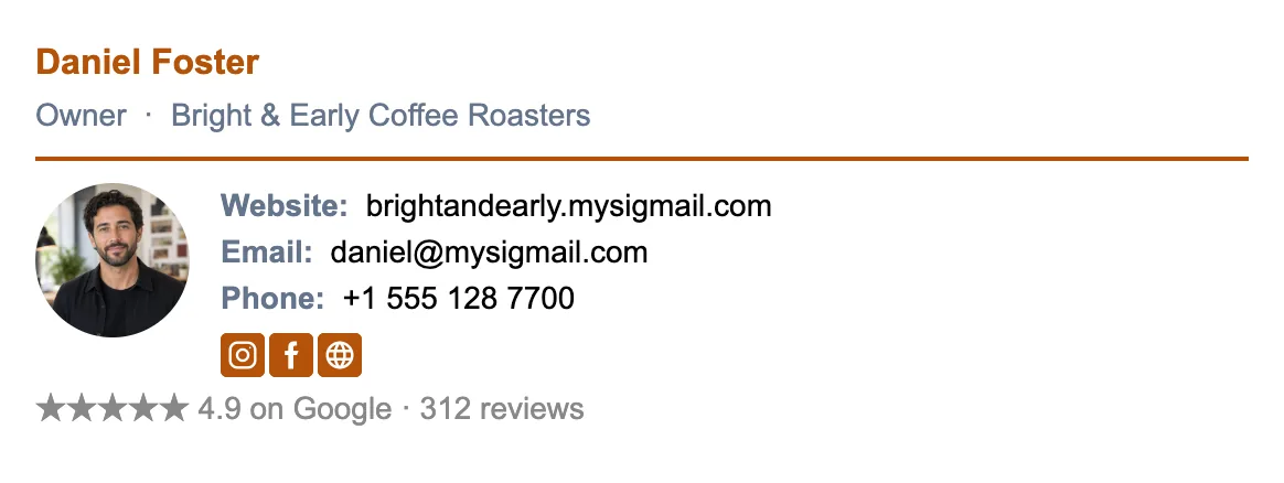
Why it works: local business runs on reputation — the reviews badge puts your best social proof in every quote, invoice, and follow-up, and the logo makes your emails recognizable in a town where people remember names.
4. The Launch Mode
When there’s something to announce: headshot, company logo, a “Book a Demo” button, and a launch banner underneath.
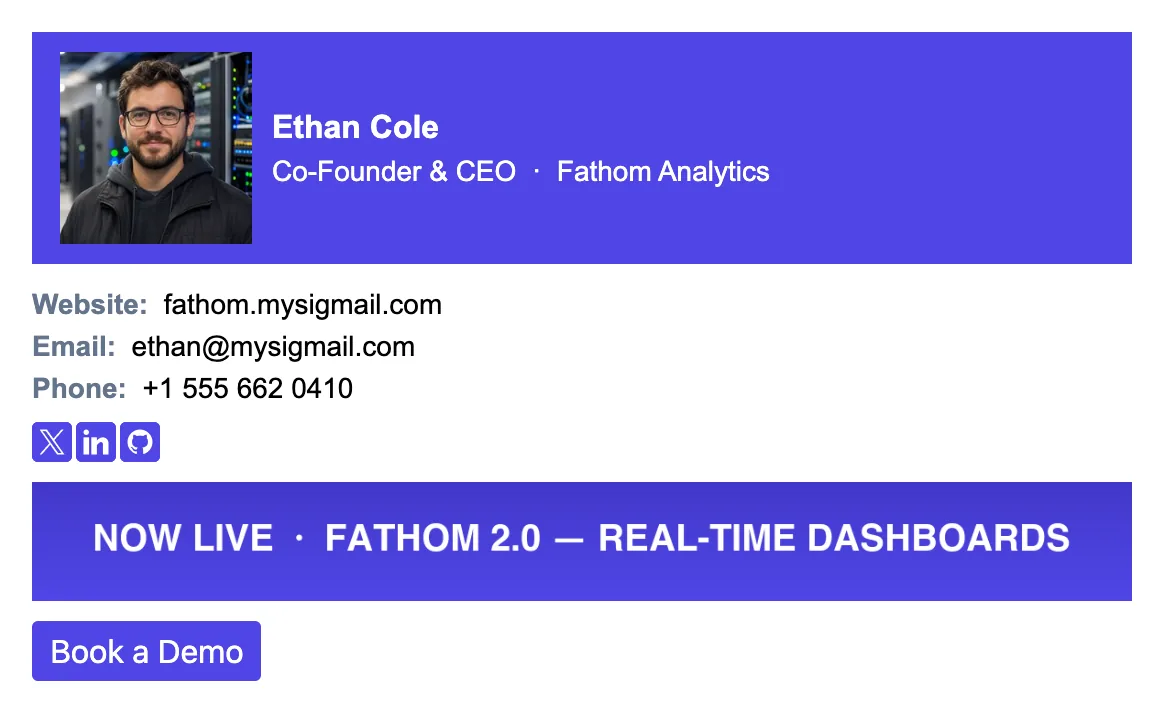
Why it works: during a launch or a raise, every email is a touchpoint — the banner announces without a dedicated “big news!” email, and the demo button captures the interest the announcement creates. Swap the banner when the news changes; the rest stays put.
Want one of these as your own? Open MySigMail and start from a template — every example above maps to a preset you can customize in minutes.
How to Actually Build One
Option 1: Use MySigMail
- Sign up here. Costs nothing to start.
- Pop in your basics: name, role, company.
- Drop your logo (or headshot).
- Add contact points—phone, email, site.
- Toss in social icons (LinkedIn, yes; TikTok, maybe not).
- Pick a template that feels “you.”
- Spice it up—banner, disclaimer, maybe a promo.
- Save, install, done. Coffee break earned.
Option 2: Do It by Hand
Sure, you can cobble something together inside Gmail, Outlook, or Apple Mail. Copy-paste text, fiddle with images, maybe even bold a word or two. It’ll “work.”
But—and this is a big but—you’ll miss out on clean design, responsive layouts, click tracking, and all those modern touches people expect. Long story short: you’ll look like you made it in 2009.
That’s why MySigMail usually wins. Consistency, branding, analytics. The whole package.
Non-Negotiable Elements
- Your name + title (say “Founder” or “Owner” loud and proud).
- Company stuff: name, logo.
- Ways to reach you: phone, email, website.
- Socials: LinkedIn at the very least.
- Banner: shout out an event or update.
- One clear CTA: “Book a call,” “See the product,” etc.
The CTA Question
Think of your signature as a quiet salesperson. Not pushy. Just there, gently nudging. Want people to schedule a call? Fine. Want them to check your new feature? Perfect.
But please—one CTA at a time. Too many and you’ll look like a street vendor waving flyers.
Don’t Do This. Please.
- No laundry lists of links.
- No home addresses (unless you love spam).
- No corny quotes.
- No selfies or celebrity shots.
- No text walls—brevity wins.
Speed Run: Build It in 5 Minutes
Your time’s worth more than fiddling with HTML. MySigMail can churn out a mobile-friendly, professional-looking signature in less time than it takes to reheat leftover pizza.
FAQ


Recent Posts
Why We Open-Sourced MySigMail Card, an HTML Email Builder
August 26, 2026
How to Create a Digital Business Card With a QR Code
August 14, 2026
How to Make a Phone Number Clickable in an Email Signature
August 7, 2026
Gmail Aliases: Different Signatures for New Emails and Replies
July 24, 2026
30 Ways to Enhance Your Email Signature and Boost Your Professional Image
May 29, 2026