
CEO and Executive Email Signature Examples
Twelve CEO and executive email signature examples, from a minimal CEO line to CFO, COO, chairman, and managing director layouts, and what each includes.

An executive's email gets forwarded more than anyone else's. An investor sends it to a partner, a journalist to an editor, a candidate to a friend who asks "who is this?". The signature is often the only context the next reader gets: your name, your exact role, the company, and the one way you want to be reached.
Below are twelve CEO and executive email signature examples built in MySigMail, for CEOs, CFOs, COOs, managing directors, chairs, and nonprofit executive directors. Each one is a real render of a MySigMail template, not a mockup. After the examples you'll find what to include, what to leave out, and how to make your own.
Examples for CEOs
1. Minimal CEO: name, title, and one line of contacts
For CEOs who want the signature to stay out of the way: emails to the board, investors, and press.
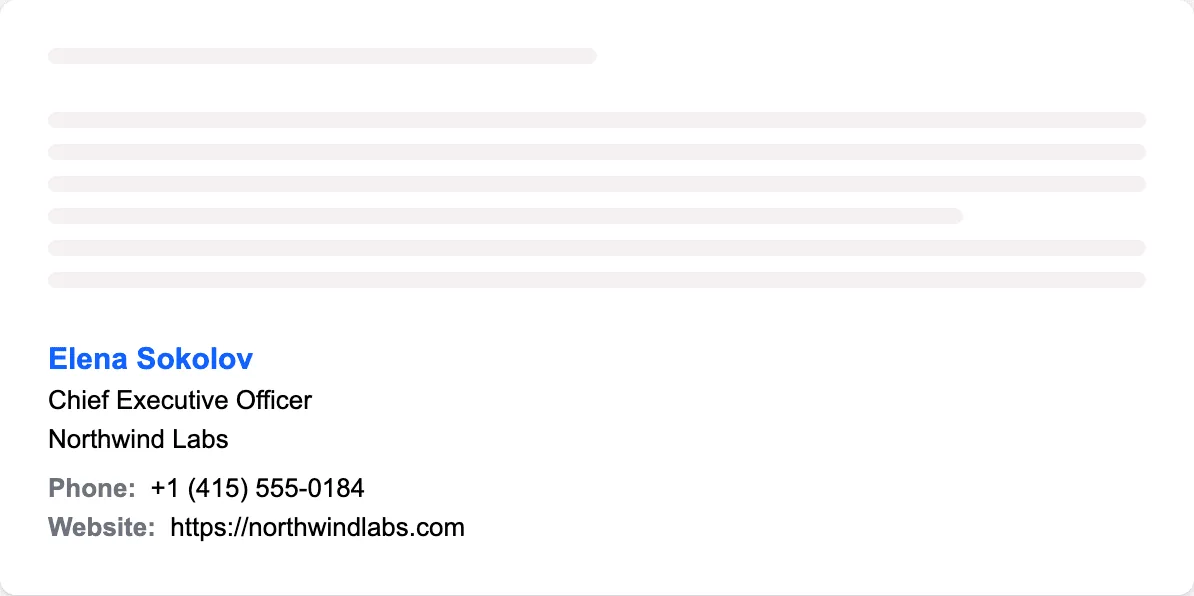
What it includes: name, title, company, and two contacts on one line. No photo, no logo, no button. It works because there's nothing to skip past.
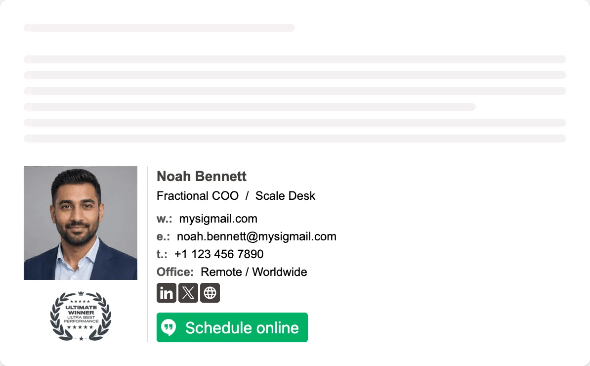
2. Founder-CEO: photo and a newsletter link
For founder-CEOs whose own name brings in customers, hires, and investors.

What it includes: a photo, a large name, two social icons, and one link to the thing you publish: a newsletter, a podcast, or a blog. No phone number: founders who get a lot of cold email often leave it out on purpose.
3. Corporate CEO: company first, short confidentiality line
For CEOs of established companies, where the company name should come first.
What it includes: the company name in capitals above your name, the full title, stacked contacts, and a one-line confidentiality notice. If your legal team has standard wording, use theirs.
4. Branded CEO: logo instead of a photo
For CEOs who want every email to look like it comes from the company, not just from them.
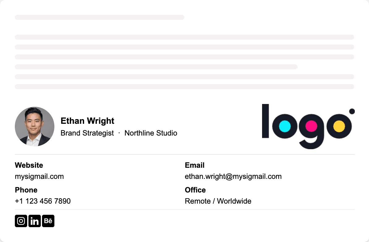
What it includes: the company logo on the left, the name and title next to it, and three social icons. For a software company, GitHub is a fair third icon. For most others, LinkedIn alone is enough.
5. CEO with an assistant line
For CEOs whose calendar is run by an executive assistant.
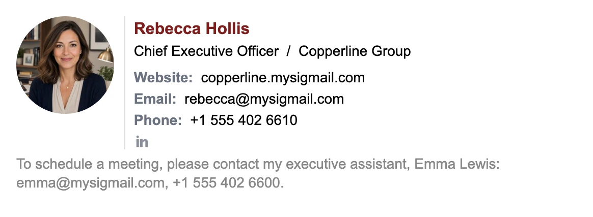
What it includes: your contacts, plus one line with your assistant's name, email, and phone for scheduling. People stop asking you for time slots, and your assistant gets the requests directly.
Examples for Other Executive Roles
6. CFO: credential and a confidentiality note
For CFOs and finance leaders who handle confidential numbers by email.
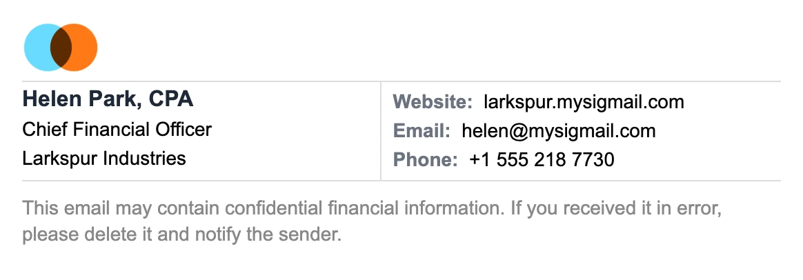
What it includes: the company logo, "CPA" after the name, the title, and a short note about confidential financial information. Add a credential only when it matters for the role. For a CFO, a CPA or CFA does.
7. COO: one line for quick replies
For COOs and operations leaders who send many short replies a day.

What it includes: name, short title, company, and email, in one line. Use it for replies and keep the full signature for first emails. Gmail can use different signatures for new emails and replies.
8. Managing director: photo and contacts side by side
For managing directors at investment firms, consultancies, and agencies.

What it includes: a photo with the name and firm in the left column and contacts in the right. Black and grey only: in finance and advisory work, the restraint is the point.
9. Chairman: serif type and a sign-off
For board chairs and senior advisors who write fewer, more formal emails.
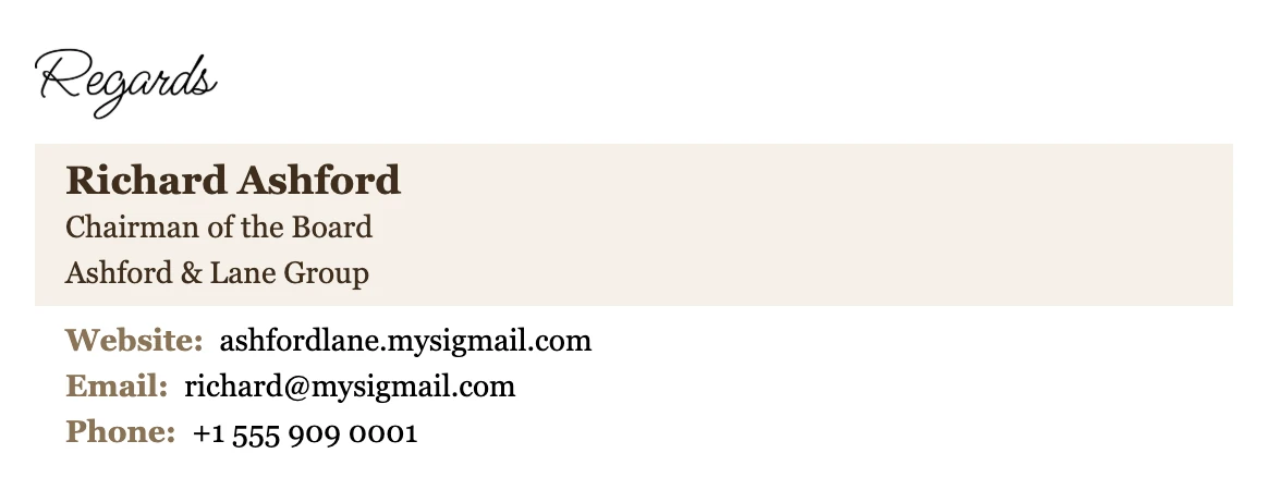
What it includes: a handwritten-style sign-off, a serif typeface, and a muted cream panel. Georgia comes with Windows and macOS, so most recipients on a computer see the same typeface.
10. Nonprofit executive director: impact report button
For executive directors who write to donors, partners, and volunteers.
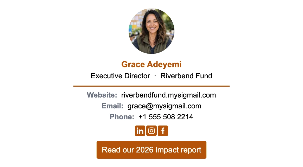
What it includes: a photo, the organization, three social icons, and a button to the latest impact report. A donor who reads the report before a call asks better questions.
Examples With a Banner
A banner is useful for an executive only when there's one thing everyone should see: results, a raise, or open roles. Remove it when the news gets old.
11. CEO with an investor update banner
For the weeks after a quarterly update or a funding announcement.
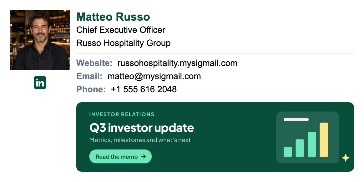
What it includes: a standard signature with a photo and a banner linking to the investor update. The banner does the announcing, so the rest of the signature stays the same.
12. CEO who's hiring
For CEOs of growing companies, whose emails reach the people they'd like to hire.
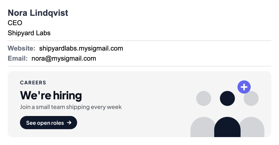
What it includes: a short signature without a photo and a "We're hiring" banner linking to the careers page. Partners, investors, and candidates all see it, and any of them can send you a referral.
Want one of these as a starting point? Open MySigMail and pick a template. The free plan includes every template. Custom colors and fonts, and add-ons such as buttons, banners, a separate logo, a disclaimer, or a sign-off, start on the Basic plan. See pricing for details.
What to Include in an Executive Email Signature
Name
Use the name people know you by in business. Add a credential only when it matters for your role: "CPA" for a CFO, "PhD" for a chief scientist. An MBA usually doesn't need to be there.
Exact title
"Chief Executive Officer", "Founder & CEO", "Chief Financial Officer", "Managing Director". Write the full title at least once, especially in first emails. Abbreviations like "COO" are fine in a compact reply signature.
Company and logo
The company name in full, and the logo if it's recognizable. If you lead several companies, show only the one you're writing for.
One direct way to reach you
Decide whether you want direct calls. If you do, add your phone. If you don't, give an assistant's contact or leave the phone out. Don't add a number nobody answers.
One link
The company website, an investor page, a newsletter, or a careers page. Pick the one that matters this quarter.
What to Leave Out
- Every board seat and advisory role. Your current title is enough. The rest belongs on LinkedIn.
- Quotes and mottos. They read as filler in an email to the board.
- More than three social icons. For most executives, LinkedIn alone is enough.
- Long legal text you wrote yourself. If your company needs a disclaimer, use your legal team's wording.
- Old banners. A funding announcement from last year says the news has stopped.
How to Make Your Executive Email Signature
Option 1: MySigMail
- Create a free account.
- Pick a template. The examples above use twelve different layouts.
- Fill in your name, title, and company.
- Add a photo or the company logo.
- Add your contacts. Leave the phone empty if you don't want direct calls.
- Add one link, or an assistant or confidentiality line as a disclaimer.
- Copy the signature into Gmail, Outlook, or Apple Mail and send a test email to yourself, then open it on your phone.
Setting signatures for the whole leadership team? On the Pro and Unlimited plans, a personalization link lets you set the layout once and have each executive fill in their own details, no account needed, so every signature matches.
Option 2: Your email client's editor
Gmail, Outlook, and Apple Mail all have a built-in signature editor, and for a text-only signature it's enough. It gets harder with a logo, a photo, and two columns: images get resized, and the layout can break on a phone. Send a test email to someone on a different email app before you rely on it.