Email Signatures with Logo: Do's and Don'ts
October 7, 2021
Use a full logo when recipients may not recognize the brand from its symbol alone. Use an icon when space is tight, the mark is recognizable, or you need a compact reply signature. Size either image for the layout, preserve its aspect ratio, and keep essential details as HTML text so the signature remains useful when images are blocked.
Full Logo or Icon?
A full logo combines a symbol with a wordmark, making the company identifiable to new recipients. An icon takes less space, but an unfamiliar mark needs nearby company text.
| Situation | Better starting point | Why |
|---|---|---|
| First contact or sales outreach | Full logo | The recipient can identify the company without already knowing the symbol. |
| Compact signature with a long wordmark | Icon plus company name in HTML text | The layout stays narrow while the company remains identifiable. |
| Short internal or reply signature | Icon or no logo | Repeated branding adds less value deep in a thread. |
| Little-known brand mark | Full logo | Recognition should not depend on the icon alone. |
| Highly recognizable symbol | Icon | The mark can carry the identity without taking over the layout. |
| Logo and headshot together | Usually a restrained full logo or small mark | The two images need a clear hierarchy instead of equal visual weight. |
Judge the choice by recognition and available space, not an arbitrary pixel limit. A support team, for example, may use a full first-message signature and a simplified reply version.
Balance the Logo with the Rest of the Signature
The logo should support the sender's identity. Keep the name and role prominent, contact links easy to find, and enough spacing between image and text.
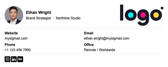
Here the portrait introduces the person and the logo identifies the company. The contact details remain readable text, so neither image must carry information that disappears when remote images are blocked. If a logo's tagline is illegible at the intended size, use an approved variant without it instead of enlarging the entire signature.
Prepare the Logo for Email
Start with an approved brand asset, not a screenshot. PNG supports transparency; JPEG may suit photographic artwork. Crop unnecessary empty space and preserve the aspect ratio.
Three measurements are easy to confuse:
- Source dimensions are the image's intrinsic width and height.
- File weight is the number of bytes recipients may need to download.
- Displayed size is the width and height the email layout asks the client to show.
A large source can display small while recipients still download the heavier file. Changing source dimensions alone also cannot fix markup that stretches an image. Prepare the asset near its intended use and set dimensions that fit the layout.
There is no universal logo width, height, or file-weight limit. Horizontal wordmarks, square icons, and portrait-plus-logo layouts need different proportions. Review the complete signature at its displayed width and keep its text dominant.
Microsoft confirms that Outlook signatures support logos and recommends preserving proportions when resizing. Its documentation also notes a VML caveat for some generated HTML, so test the installed result.
Insert the Logo without Losing the Layout
MySigMail provides 15 templates and a logo addon. Choose a template whose image position fits the asset: a wide wordmark needs different space from a square mark.
MySigMail offers Copy as Select and Copy as HTML. Many visual signature editors accept the rendered selection; workflows that explicitly request source markup can use the HTML copy. Follow the client's current instructions.
You can create and preview a signature in MySigMail before adding it to your email client.
Keep the Signature Useful When Images Are Blocked
Recipients may block remote images. Keep your name, company, role, phone number, and essential links as HTML text rather than flattening them into one image.
Alternative text depends on the image's purpose. The W3C image accessibility guidance explains that alt text should communicate function and context, not merely repeat a filename.
- A decorative logo can use an empty
alt=""in the HTML when adjacent text already identifies the company and the image adds no new information. - An informative logo needs alt text that conveys the company or message it represents.
- A linked logo needs a meaningful accessible name that describes the link's purpose, such as the company homepage, rather than “logo” or “image.”
Avoid putting essential text only inside an image. Images of text scale poorly and may be unavailable to recipients using assistive technology or image blocking.
Test Light Mode, Dark Mode, and Real Messages
No logo can promise universal dark mode compatibility. Clients may leave it unchanged, alter surrounding colors, or render backgrounds differently. Dark transparent lettering can disappear; a white image background can look awkward.
Test approved light and dark variants. An intentional background or boundary may help, but verify it in real clients. See the guide to email signatures in dark mode.
Send real messages to multiple recipients and check:
- Light and dark appearance
- Desktop and narrow mobile layouts
- Gmail, Outlook, and Apple Mail where relevant
- A new message, a reply, and a forwarded thread
- Image loading on and off
- Every link and phone number
- The full and compact reply signatures
Google notes that an oversized image can break a Gmail signature and recommends resizing or re-uploading it; formatting can also vary by client. Apple documents how to drag an image into a Mail signature. Test the received message instead of assuming that every recipient client will reproduce the sender-side preview.
Troubleshooting Common Logo Problems
The logo looks blurry
Check whether a small source is being enlarged. Export a clean asset at an appropriate source size and avoid screenshots or repeatedly recompressed files.
The logo appears enormous
Resize the asset for the layout, re-add it, and inspect a composed message. Gmail recommends resizing and re-uploading when an oversized image breaks the signature.
The logo is squashed or stretched
Restore the aspect ratio instead of forcing width and height independently. If the slot has the wrong shape, choose another layout.
The logo disappears in dark mode
Test an approved higher-contrast variant or add a deliberate background. Transparent artwork will not remain visible against every client-generated background.
The logo appears as an attachment
Confirm that the image was inserted through the supported signature workflow. If only certain recipients see an attachment, their server or client may be responsible. Keep contact details as text.
The reply thread feels crowded
Create a compact reply version with an icon, a smaller logo treatment, or no logo. Keep the sender's name and one useful contact route. The aim is to reduce repetition without making the sender anonymous.
Practical Logo Checklist
- Choose a full logo when recognition matters; use an icon when space and repetition matter more.
- Keep name, company, and contact details as HTML text.
- Use an approved, clean source asset and crop unnecessary whitespace.
- Preserve the logo's aspect ratio.
- Distinguish source dimensions, file weight, and displayed size.
- Fit the logo to the complete layout instead of following a universal pixel limit.
- Give linked or informative logos meaningful accessible names; use empty alt only when truly decorative.
- Test with images blocked.
- Check light mode, dark mode, desktop, mobile, replies, and forwards.
- Send to multiple real email clients before rolling the signature out.
A logo works when recipients can identify the company without losing sight of the person and contact details. Choose the variant that suits the message context, size it for the actual layout, and let real recipient tests—not rigid design myths—decide whether the signature is ready.



Recent Posts
Gmail Signature Too Long? How to Fix the Error
September 17, 2026
Why We Open-Sourced MySigMail Card, an HTML Email Builder
August 26, 2026
How to Create a Digital Business Card With a QR Code
August 14, 2026
How to Make a Phone Number Clickable in an Email Signature
August 7, 2026
Gmail Aliases: Different Signatures for New Emails and Replies
July 24, 2026